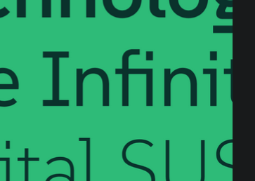
Ah, looks like it’s a pre-nerdified cascadia! Not my personal style, but I know a few that love cascadia.
- 0 Posts
- 37 Comments
U001 is new to me, so here’s a link for others to look it up.
As a huge expanse fan, I’m glad someone brought this to life! (Shout-out for the space the nation podcast if you like nerds breaking down the episodes and need a good back catalog for the dark winter days)
Dropping a link for others since it’s the first time I heard of it.

 1·9 days ago
I can remember!
The SATA SSD with Windows died in 2016.
I was gonna suggest Jones soda, but they seem to be owned by a chain of increasingly weird weed and crypto parent companies now.
Not sure if this the display manager is the issue, but SDDM is the other “big player”.
Enshitification has come for them too:
Enjoy it while you can.

 1·1 month ago
Hey, me too!

 5·1 month ago
I envy your lack of this particular childhood trauma.

 9·1 month ago
No kidding.
I remember dad making me read some book proving the end times were here because Saddam was Nebuchadnezzar reborn (the proof was their silhouettes looking similar). So much “whore of Babylon” stuff.
He recently sent me a YouTube video of a guy talking about the valley of Jehoshaphat and Trump heralding the end times.
It never ends.

 192·2 months ago
When you start proselytizing your feelings about it including through seemingly bad faith posts on the Internet that beg the question.

 2·2 months ago
And shake it all up.
Was (not was) - Walk the dinosaur featured on the live action Flintstones movie.

 2·3 months ago
I wonder if it’s more because we frame the question by altering the structure to indicate the appropriate response.
We could just as well ask “you are from where?” Or “your name is what?” That matches the expected sentence structure of a response, and the natural pitch rises.

 243·3 months ago
True! My first thought is usually drugs without further context.

 45·4 months ago
So what I see there is that badly designed fonts require ligatures to correct interactions.
Like, I get that there are some neat ones, e.g. I have them turned on when writing code for symbols, but they seem wholly unnecessary and distracting in alphabetical characters.
But I’m also the kind of weirdo that thinks the world needs more monospace fonts.
/shrug

 71·4 months ago
To me, that’s even worse. Ligatures that have 0 separation where it’s expected short circuit my reading comprehension.

 64·4 months ago
The “fi” combination also seems problematic since they seem to intersect.

Backstory: my mom wanted a very specific clock from a furniture store.
She passed from esophageal cancer 6 weeks later and 6 years ago next week.